
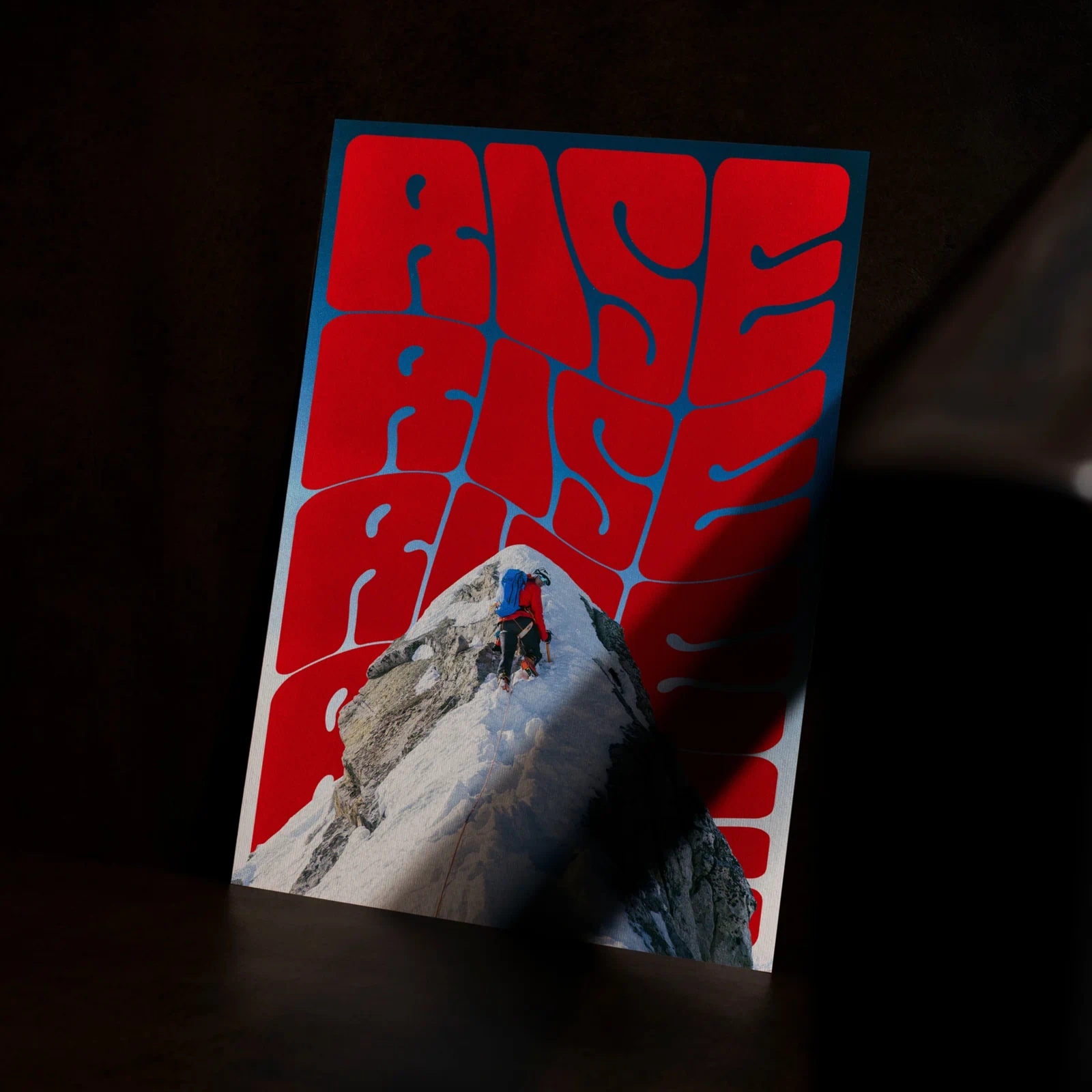
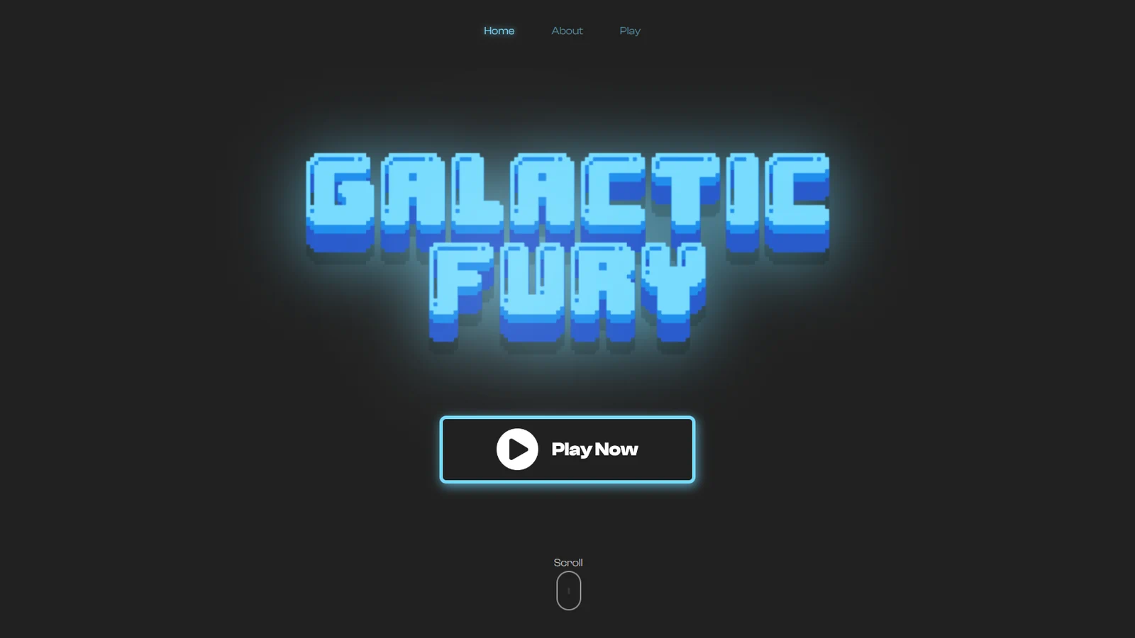
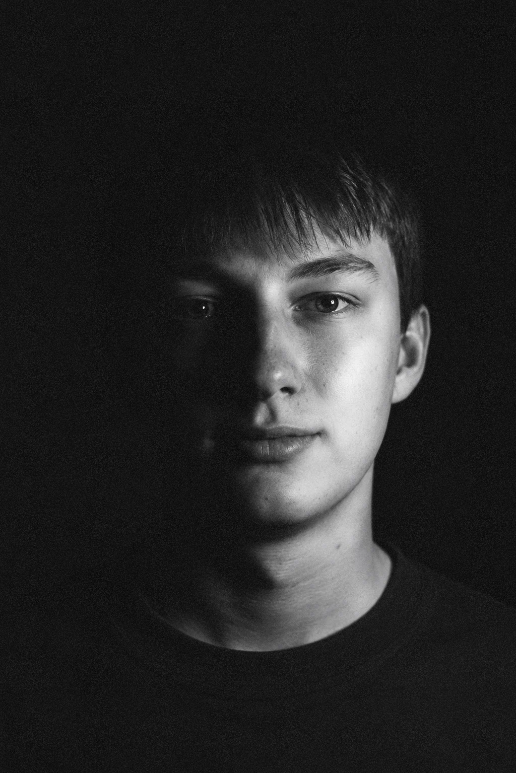
This is a personal branding project I did for myself. The goal was to create a visual identity that represent me and my work. I like to keep things simple and clean, so I decided to go with a minimalistic design.
Year
Type
Scope
Role
The logo is made up of 4 rounded half-circles that form a square shape. In the center part of the logo, inbetween the half-circles, this creates an intresting negative space that looks a bit like a turbine or tornade.
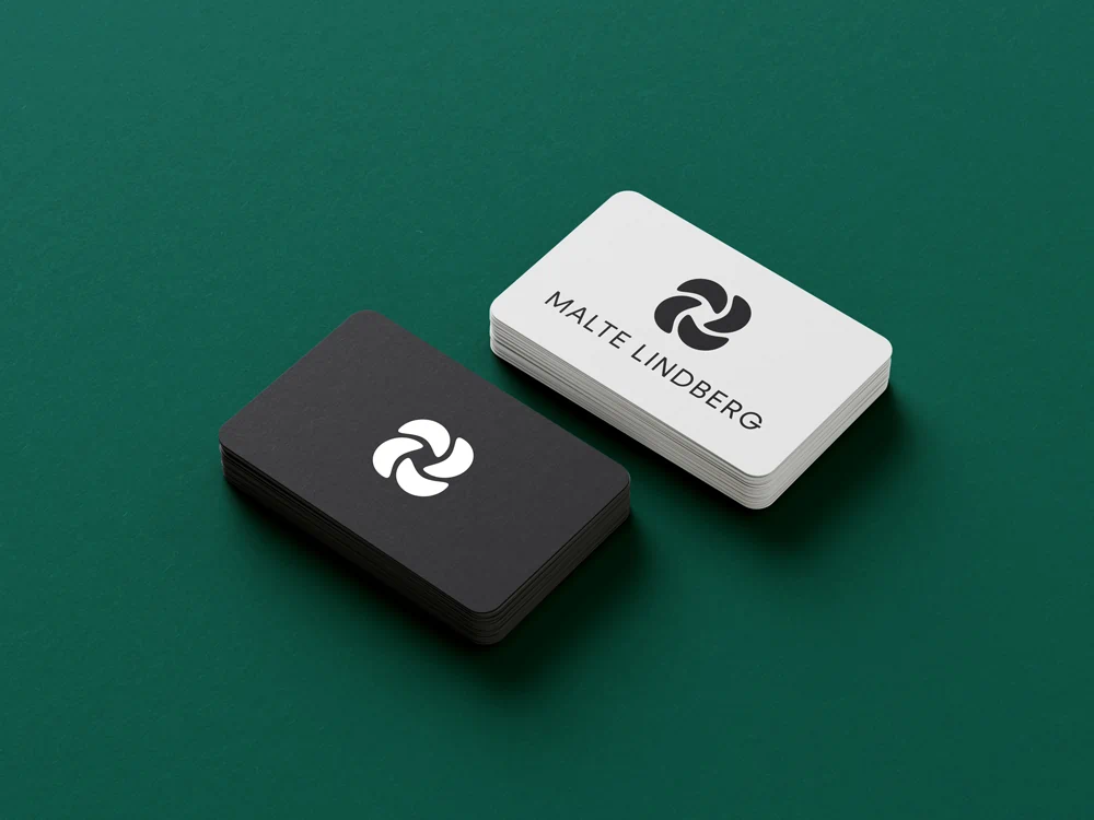
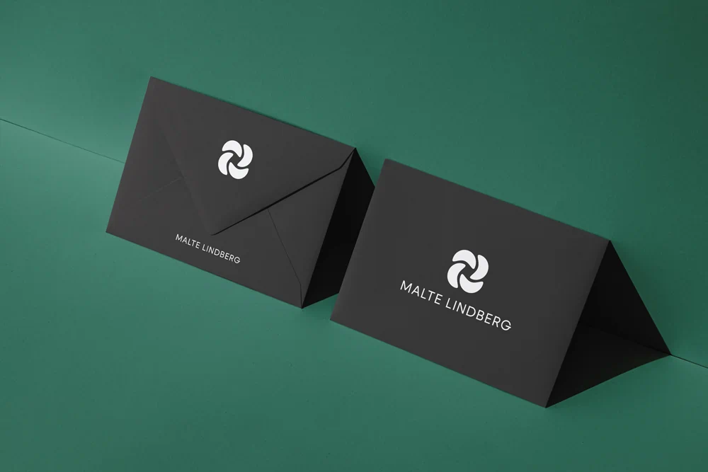
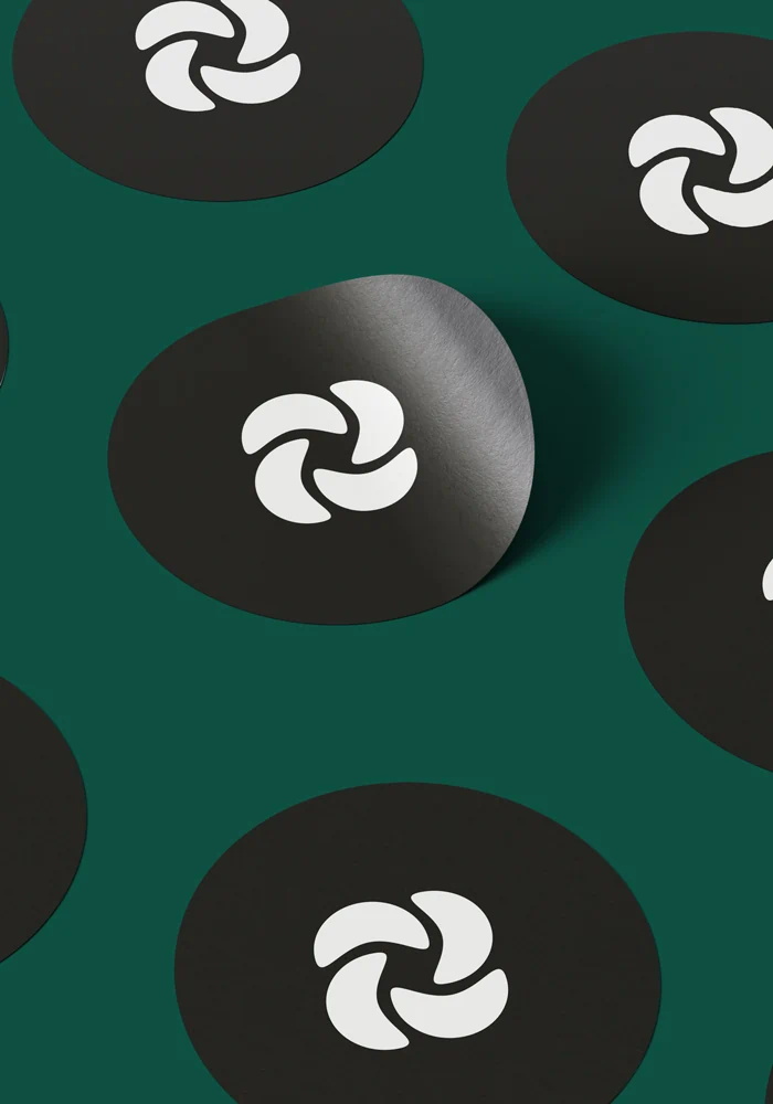
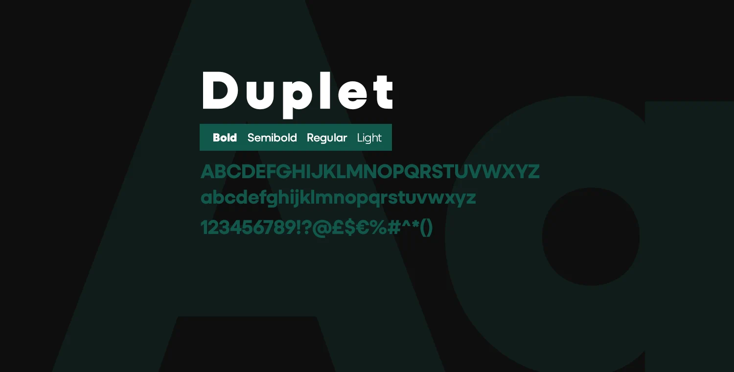
The color pallete is made up of 4 colors, black, dark green, white and grey. The black is mostly used for backgrounds but could also be used for text and logo if needed. The dark green is also mostly used for backgrounds but also for highlighting text and other elements. The white is the main color for text. The grey is mostly used for elements that are not highlighted or not the main focus.